Learning coffee break! Today some tipps on “form usability”, a topic that even backend developers should not leave alone.
- The final, one and only way to validate email addresses:
And for form validation: check if there is an “@”. Nothing more, nothing less. If you want to know why, read: The 100% correct way to validate email addresses.
- But in one point I have to disagree:
Next, we want to do some validation to ascertain if they correctly entered their email address.
Not possible.
At least for common email domains, an auto correct feature cannot hurt. For this, there is mailcheck, which actually improves usability of entering email addresses.

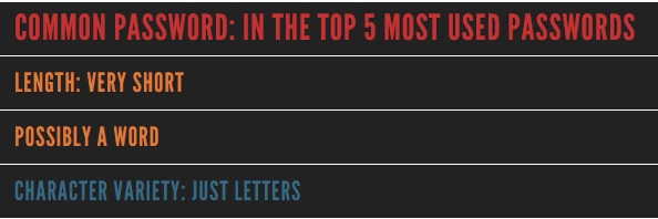
- It’s a nuisance with password inputs, to force rules upon users (between 3 and 15 characters, at least one special character, upper case and lower case, whatever) – IMHO it is an illusion that this leads to more secure passwords. A better solution is an indicator for password security. But even there, I’ve seen much nonsense. So if you do it, do it right. A good example is howsecureismypassword.net:
The source code is freely available on Github.
- One principle of interactive design are affordances and constraints. In a nutshell, it’s about making provided actions perceivable and make it impossible to do anything else.
An example for the latter: Enable submit buttons only after all required fields are enabled and disable them on click to prevent accidental multiple submissions. Here are two jQuery snippets for this: Enable Disable Submit Button using jQuery


Hello there ,
I was using the password tool you mentioned on your page here: schmengler-se.de/2016/10/5-minuten-tipps-form-usability/
While it does the job overall, I found another tool to be a better alternative. I thought other users might also appreciate it if you update your page.
It is a clear and ad free: http://www.vpnmentor.com/tools/passwordmeter/
In hope I helped back,